Music Pathways: Brand Design for Career Discovery.
A brand and UX redesign of The Music Pathways Project (TMPP), a UofT Scarborough initiative that helps high-school and post-secondary students see music careers as more than "perform, teach, or quit." Replaced static PDFs and a generic band photo with a confident homepage, an 8-pathway interactive preview, dual audience entry points for students and educators, and a 3-step discovery flow. Built on CBBE branding theory and consumer behavior principles to reduce cognitive load and reframe the brand around possibility.
8
career pathways
30+
example roles surfaced
100%
research-informed
2
audience entry points
Skills used
chapter 01 —
Reframing what a music career can look like.
TMPP's research showed a gap between how students picture music careers and how the industry actually works today. Sound design, music technology, digital content, community arts, arts management, music therapy: none of it surfaced clearly in the old site. The redesign turns that information into something students can actually navigate: a confident hero that names the reframe out loud, an 8-pathway preview that cycles through the full scope on first load, dual entry points for students and educators, and a 3-step discovery flow that gets people from "I don't know my options" to "here's what to do next."
chapter 02 —
From PDFs to a guided discovery experience.
The original site put career information behind dense PDFs and an isolated keyword chatbot. Students had to scroll, decode unfamiliar job titles, and make their own connections. The homepage led with a single band photo, which quietly reinforced the misperception that TMPP was a performance platform. This redesign applies Keller's CBBE pyramid and core consumer behavior principles to lower the cognitive load: visual hierarchy that surfaces the full pathway set instantly, dual audience tracks so students and educators self-route, and a step-by-step structure that builds confidence rather than overwhelm.
chapter 03 —
Product decisions.
The strategic calls behind the prototype and the reasoning each one rests on.
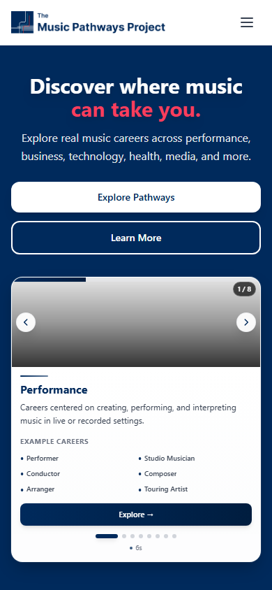
Show all 8 pathways in the first viewport.
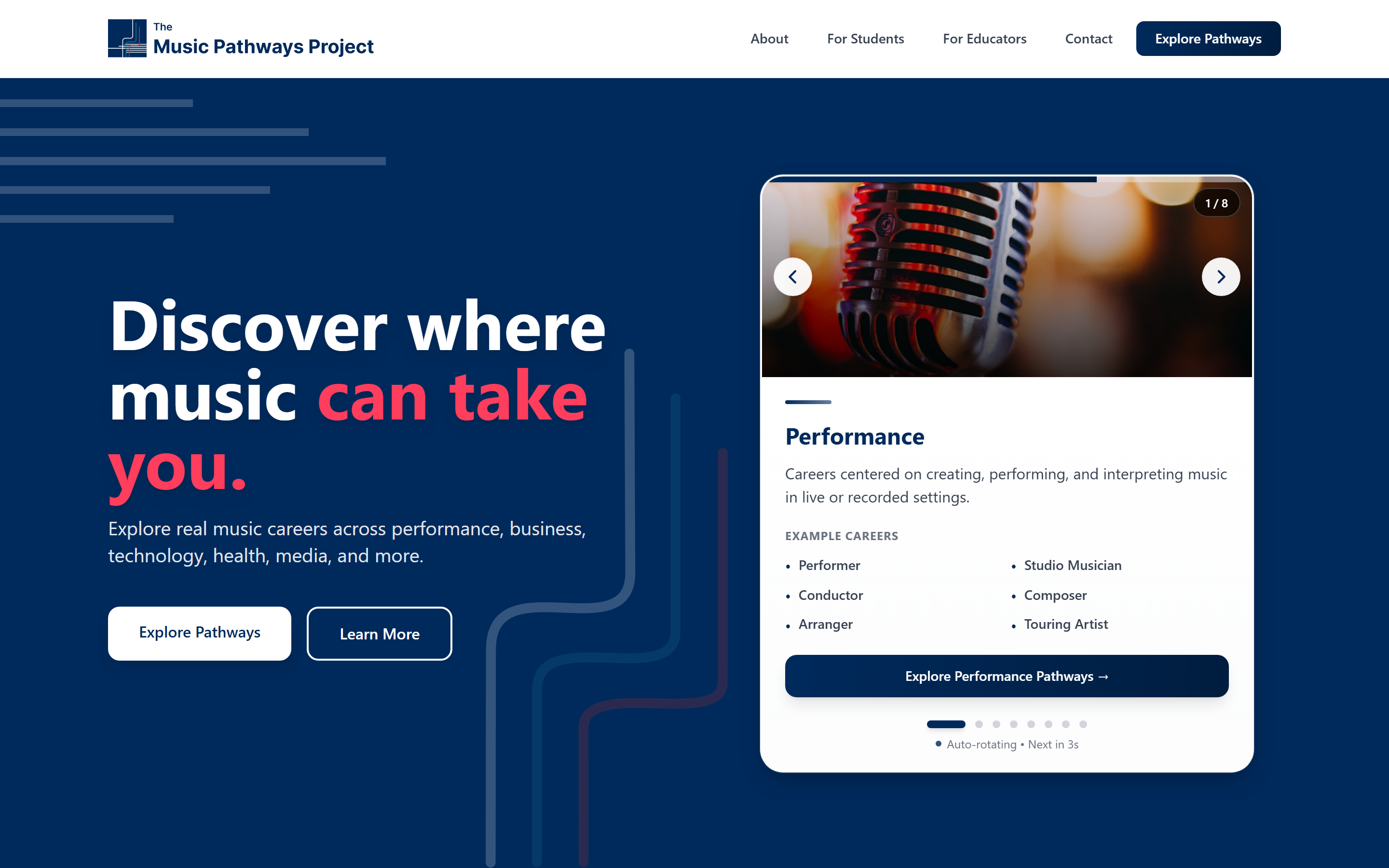
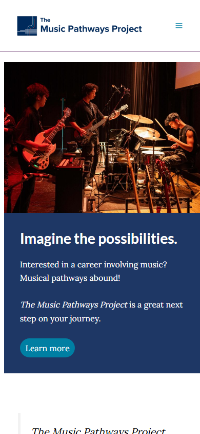
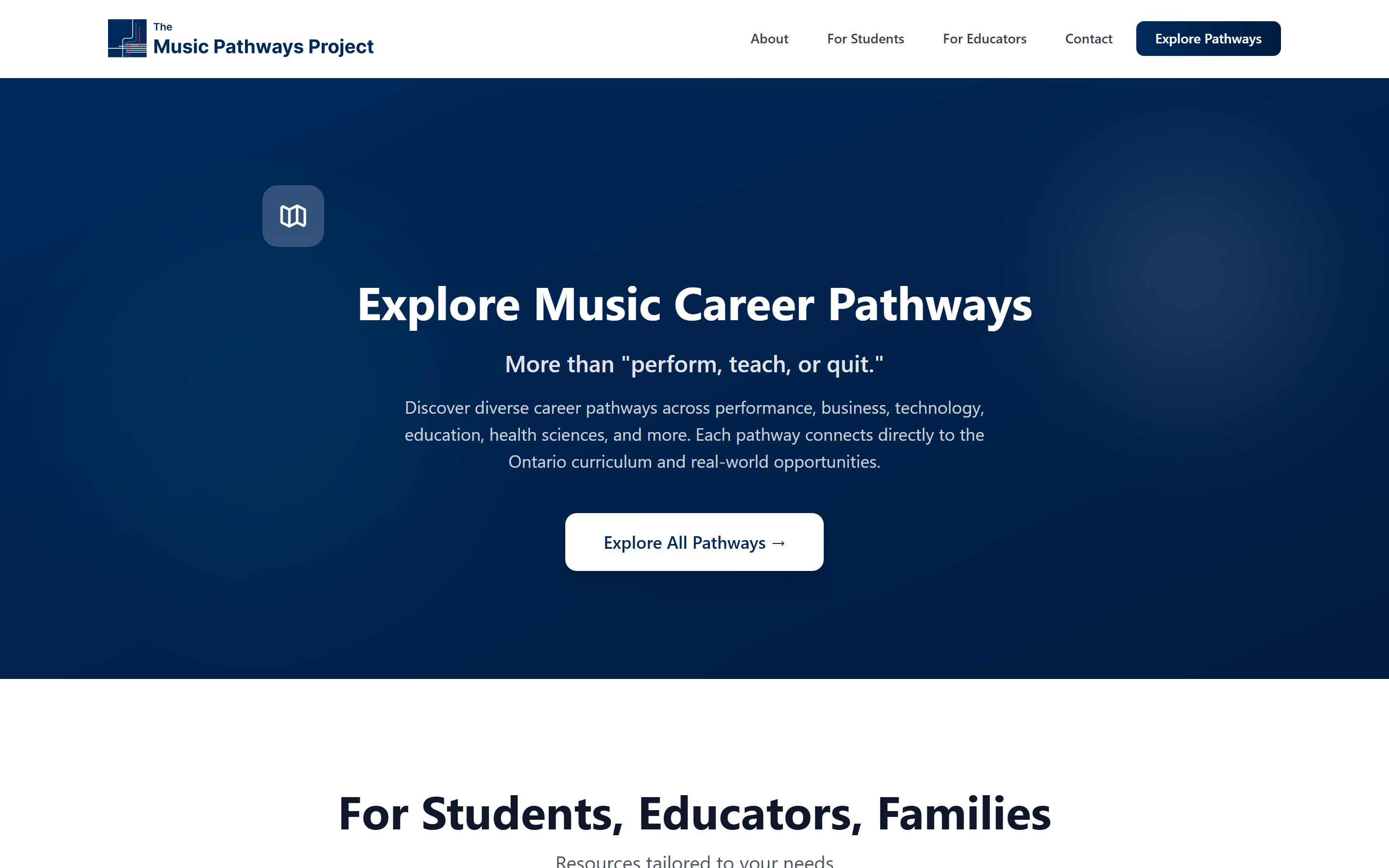
The original homepage led with a band photo. Students who saw it assumed TMPP was a performance platform and never scrolled past. The redesigned hero cycles through all eight career clusters (performance, education, business, production, publishing, health sciences, entertainment law, media) as the auto-rotating preview card. By the time the user has finished reading the tagline, they have already seen the reframe in motion. The breadth is not described, it is demonstrated.
Keller's offensive brand element criteria —
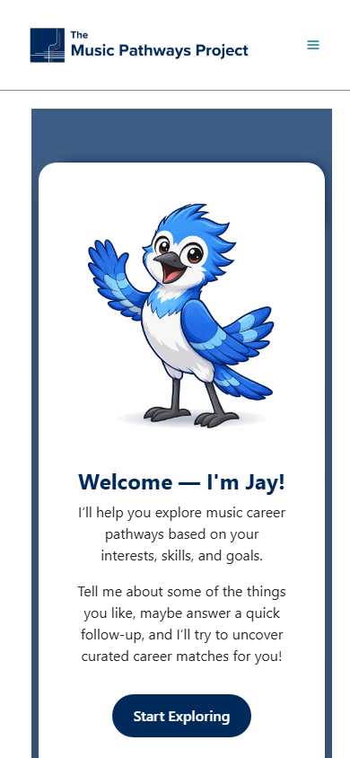
Tempo (a metronome) replaces Jay (a blue jay).
The original mascot was Jay, a blue jay character. Friendly, but a blue jay doesn't actually say "music." The mascot also had to read as music without forcing one culture's notation system on a multicultural Canadian student body. A treble clef or piano keys would have quietly excluded students from non-Western musical traditions. A metronome is universal across genres and cultures, and it just means time and pace. Tempo's LED-faced design plus the U of T navy + crimson palette satisfies Keller's offensive criteria (memorable, meaningful, likable) and finally gives the chatbot a face that's on-brief.
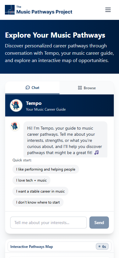
Interactive map as the primary surface, chatbot as the supporting voice.
The original led with a keyword chatbot that operated in isolation from the resources. Students had to phrase questions correctly to get answers, and the answers were text-only with no visual context. The redesign inverts that hierarchy: the interactive pathway map is the primary way to explore, and the chatbot exists alongside it to highlight clusters that match a student's plain-language interest. The map gives students agency; the chatbot gives them help. Neither alone would have replaced the PDFs.
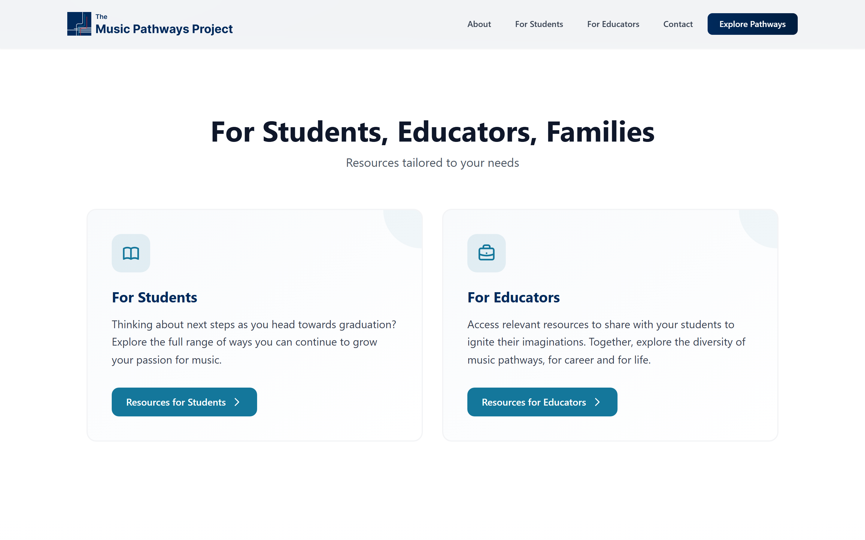
One site, two self-routing audiences.
Students need to discover unfamiliar roles. Educators need resources they can hand to a class. Building two separate sites would have doubled the maintenance and split the brand. Instead, the homepage offers a clear two-card split (For Students and For Educators) that lets each audience self-route after the shared hero. Same brand, same content backbone, audience-specific copy and CTAs from the moment of choice forward.
Lightweight prototype chatbot, not a production AI build.
A full LLM-backed chatbot would have meant API costs, content safety review, and weeks of evaluation work for a course-scope prototype. The build uses keyword matching that triggers the same visual highlighting the production version would do. It demonstrates the intended UX (student types interest, map responds, Tempo speaks) without the infrastructure overhead. The right move when the goal is to validate the experience design, not to ship to thousands of users on day one.
Keller's Customer-Based Brand Equity —
CBBE pyramid as the page structure.
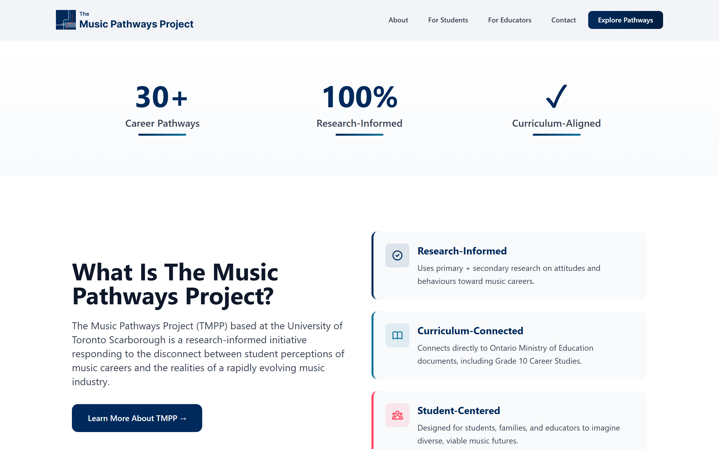
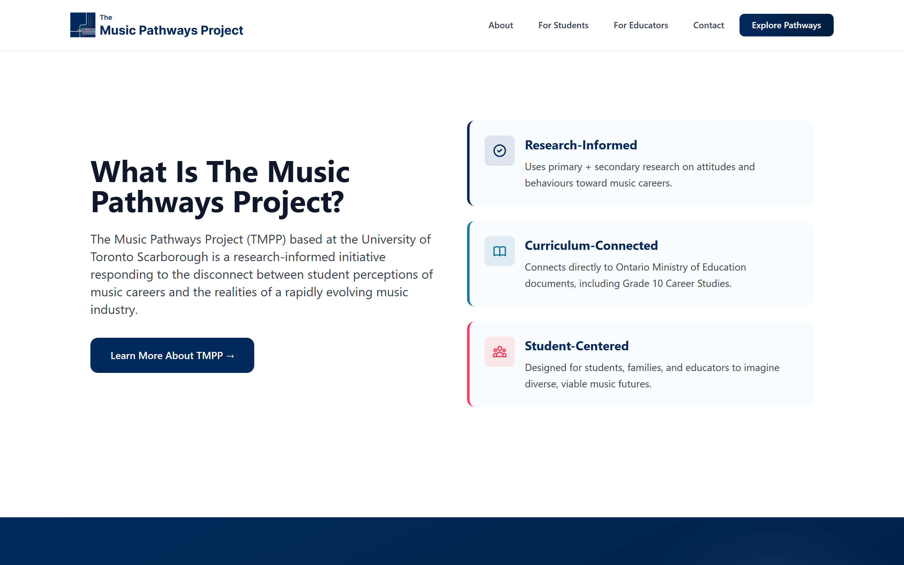
The page sections aren't arranged by convention; they're arranged by CBBE rung. Salience in the hero (full pathway set visible immediately). Performance + imagery in the three pillars (Research-Informed, Curriculum-Connected, Student-Centered). Judgments in the stats strip (30+ pathways, 100% research-informed). Feelings in the dual-audience care. Resonance in the 3-step discovery flow that drives return visits. Every section earns its place by doing brand-equity work, not by checking a layout box.
chapter 04 —
Before and after.
Captured from the live original site at musicpathways.ca, paired side-by-side with the redesigned screens to show the actual delta on the same surfaces.
Homepage.
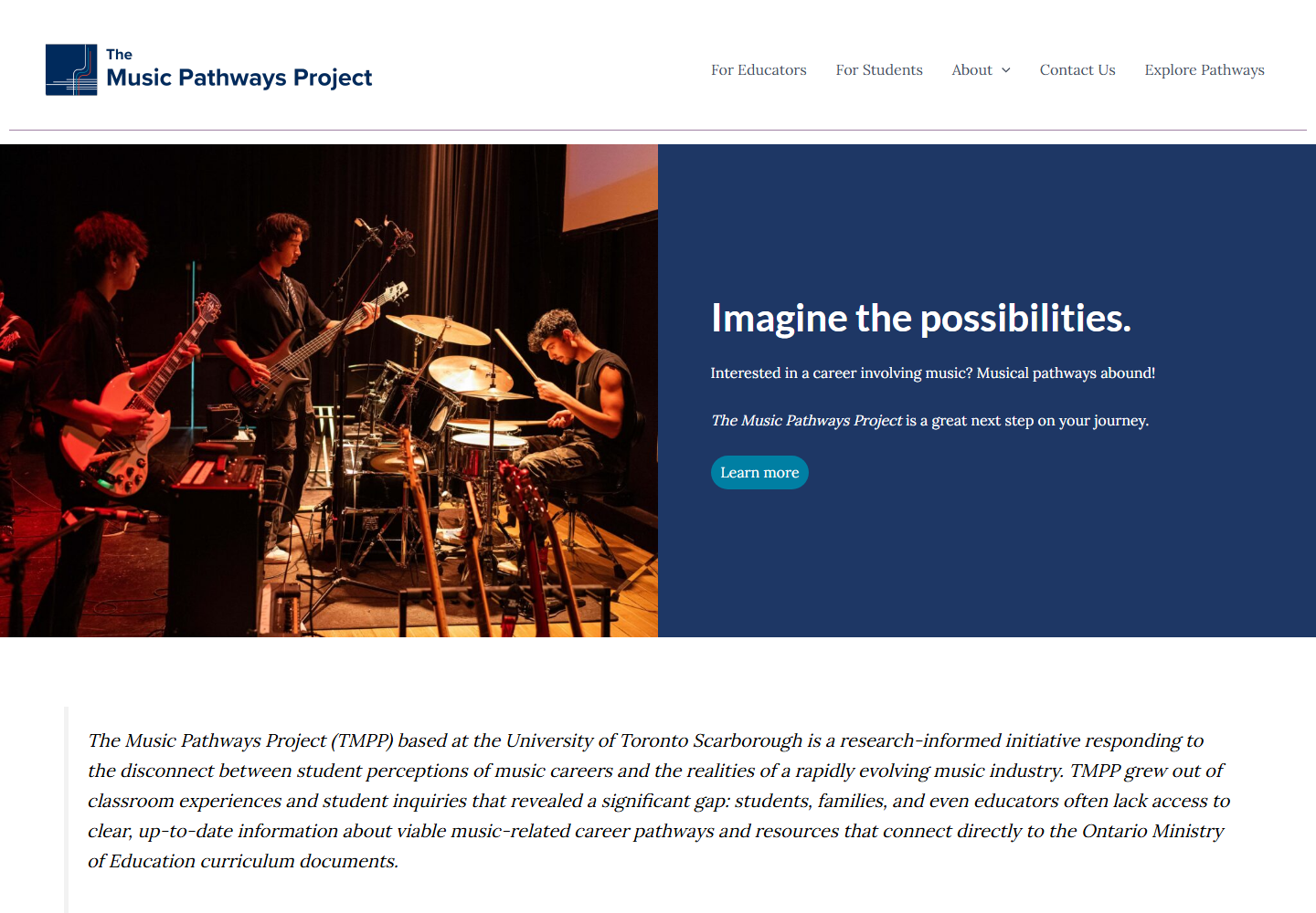
A static band photo plus a paragraph block becomes an animated 8-pathway preview, a confident tagline that names the reframe ("Discover where music can take you"), and a clear path into the explorer.
Chatbot and explorer.
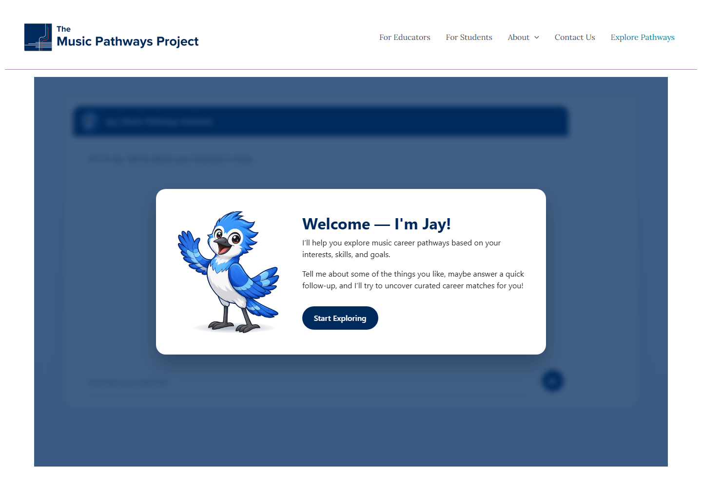
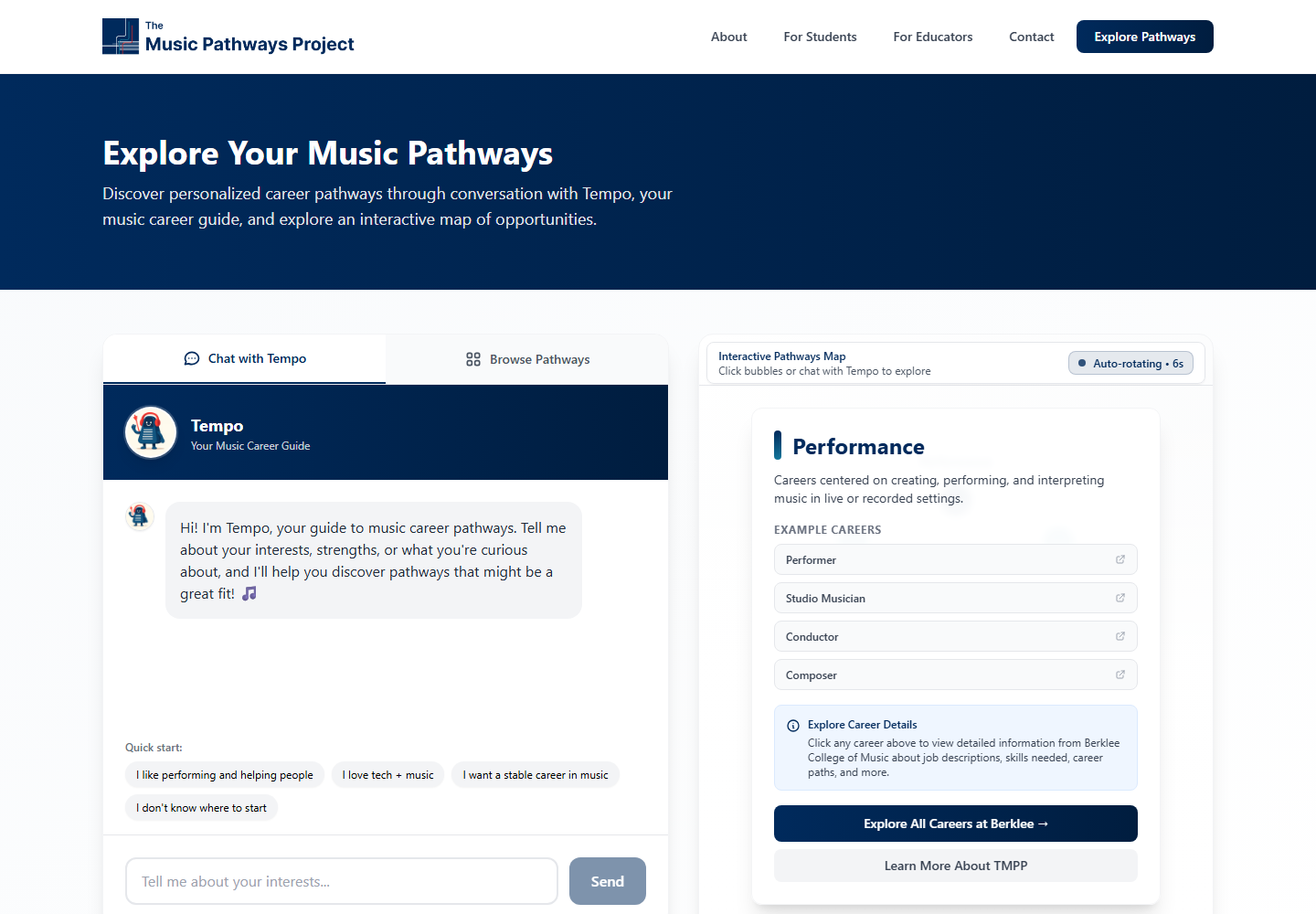
A standalone "Welcome — I'm Jay!" chatbot modal becomes Tempo the metronome, sitting alongside an interactive pathways map that visualizes career clusters and surfaces example careers per cluster.
Mobile homepage.
The mobile experience gets the same reframe end-to-end (same hero, same pathway preview, same tagline emphasis), responsive across screen sizes instead of a different IA on phone.
Mobile chatbot / explorer.
Jay's welcome modal on mobile becomes Tempo plus a touch-friendly version of the pathways map, scaling the desktop interaction model down without losing functionality.
chapter 05 —
Key findings.
8 pathways
The reframe has to happen on first load
If students only see "Performance" they assume the rest of the platform follows. The rotating 8-pathway preview in the hero exists to break that assumption before they scroll, by making the scope of music careers visible inside the first viewport.
0 PDFs
Static documents kill exploration
Dense PDFs and unfamiliar terminology raise search costs and discourage browsing. Replacing them with grouped, visual pathways turns a research task into something closer to a guided tour, supporting both self-directed and structured exploration.
2 audiences
One funnel doesn't fit students and educators
Students need to discover unfamiliar roles. Educators need ready-to-share resources for their classrooms. Splitting the entry point reduces friction for both and signals the brand serves more than one stakeholder, deepening category salience.
Confidence
Reduce anxiety, not just steps
Research kept surfacing that students value tools that build confidence over tools that save time. The redesign moves up Keller's means-end chain from "find the right document" to "feel supported deciding what to explore next". The brand promise is calm and possibility, not just information.
chapter 06 —
Key features.
The signature product moments. Each one is a complete scenario the prototype demonstrates end to end.
feature 01 —
Redesigned homepage banner.
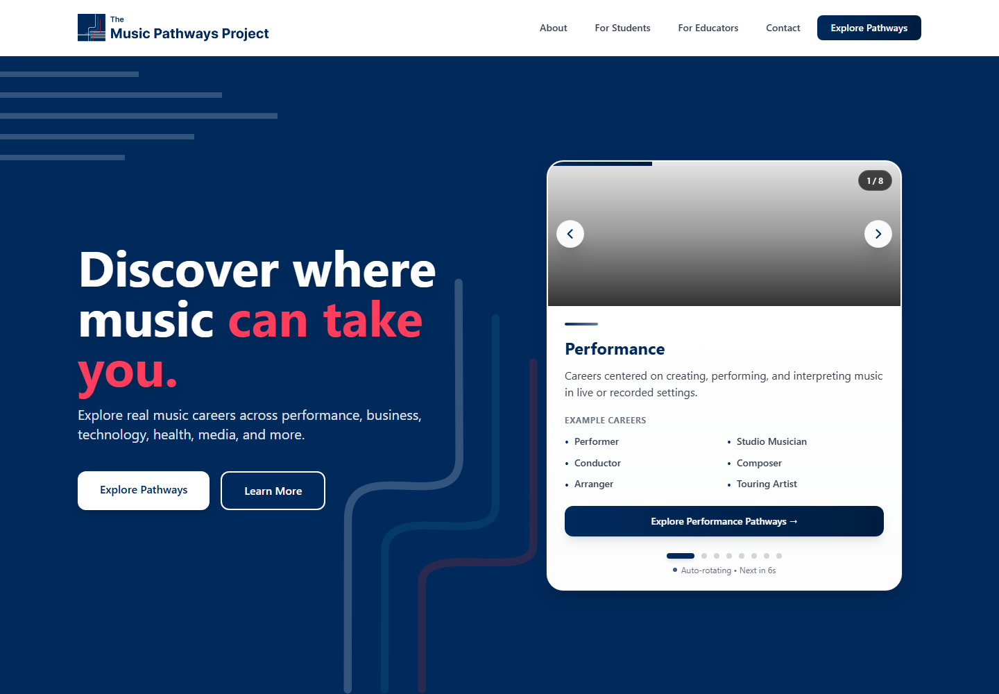
Confident navy gradient hero with the tagline "Discover where music can take you," typographic emphasis on "can take you," and a side-by-side rotating pathway preview that auto-cycles through all 8 career clusters. Replaces the static band photo that had been quietly defining the brand as a performance platform.
feature 02 —
Stats + credibility strip.
A clean three-stat band right under the hero: 30+ Career Pathways · 100% Research-Informed · Curriculum-Aligned. Anchors the brand promise in evidence before students even read the explanatory section underneath.
feature 03 —
Three pillars of the brand.
Research-Informed, Curriculum-Connected, Student-Centered: three cards positioned next to the "What Is The Music Pathways Project?" paragraph. Each pillar gets a meaningful icon, a one-line label, and a sentence of substantiation.
feature 04 —
Pathways explorer entry point.
A standalone CTA section: "Explore Music Career Pathways" with the subtitle "More than 'perform, teach, or quit.'" Direct invitation to dive into the explorer, anchored by the navy theme that ties back to the hero.
feature 05 —
Dual-audience onboarding.
Two-card split: "For Students" with a book icon and a graduation-focused message, and "For Educators" with a briefcase icon framing TMPP as a classroom resource. Each card has its own CTA so the two audiences never have to share a funnel.
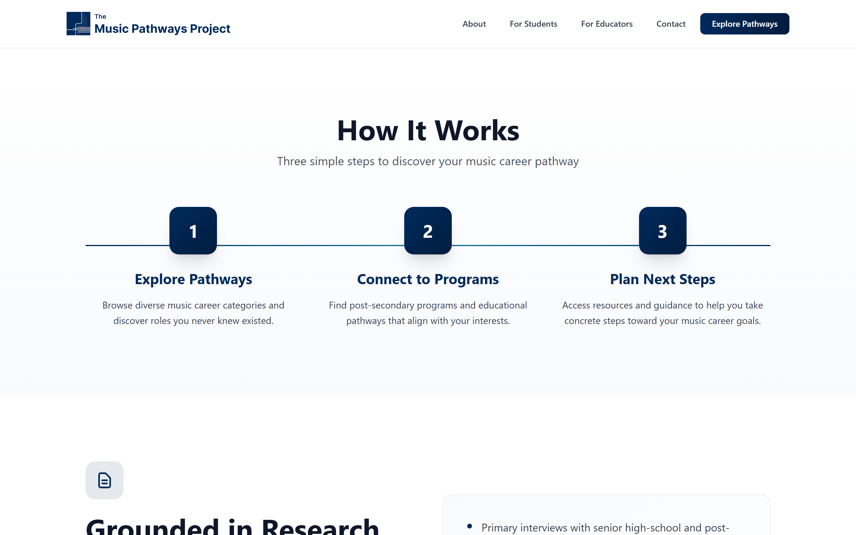
feature 06 —
Three-step discovery flow.
"How It Works" stripped to three numbered steps: Explore Pathways → Connect to Programs → Plan Next Steps. Each step has a one-line description that turns "career discovery" into a concrete, repeatable process.
chapter 07 —
Tools & technologies.
CBBE Framework
Keller's pyramid drove every design decision: salience (full pathway set in the hero), performance + imagery (visual hierarchy and pillar cards), judgments + feelings (research credibility, calm tone, dual-audience care), resonance (3-step structure that drives return visits).
Brand positioning + mantras
Internal mantras "Illuminate Pathways. Redefine Music. Empower Futures." and "Discover Pathways. Connect Music. Inspire Futures." kept tone consistent across copy. External tagline "Discover where music can take you" sits in the hero and recurs in the explorer CTA.
Consumer behavior principles
Reduced search costs (visual cluster preview replaces PDF hunting), cognitive load (3 pillars + 3 steps instead of one wall of text), and audience friction (split funnel so students and educators never have to share an onboarding).
Figma + React prototype
Designed in Figma for stakeholder review, then built as a Vite + React + Tailwind prototype deployed on Netlify so the interaction (rotating cards, animated branching lines, audience split) could be tested in-browser, not just on a still mockup.
AI illustration iterations
Used iterative AI prompting to develop the rotating pathway preview cards and visual styling for the explorer, aligning with TMPP's navy + crimson palette and the UofT brand context.
chapter 08 —
What the redesign actually moves.
The original TMPP site was correct but invisible. The information was research-informed, the careers were real, the support resources existed, but students would not have known any of that from the homepage. The redesign's job was not to invent content, it was to make the brand legible: the moment a student lands, they see the reframe ("more than perform, teach, or quit"), see the evidence (30+ pathways, 100% research-informed), and see the next step (explore, connect to programs, plan).
Applying CBBE meant treating every section as one rung of the pyramid: salience in the hero, performance and imagery in the pillars, judgments in the stats strip, feelings in the dual-audience care, resonance in the discovery flow. Consumer behavior principles meant lowering search costs at every turn: visual instead of textual, grouped instead of listed, guided instead of open.
For my own product instincts, this project drove home that great branding is not decorative work. It is structural work: it decides which 8 things land in the first viewport, which audiences self-route without friction, and which sentence gets repeated across hero, explorer, and CTA so the brand promise is felt rather than declared.
chapter 09 —
What this redesign is, and what it isn't.
the honest caveats —
- High-fidelity prototype, not a fully production-replacement website. The live build covers the homepage, dual-audience entry, and the discovery flow; deeper pages (full explorer, chatbot, resource pages) are designed but not all fully implemented.
- The Tempo mascot and integrated AI chatbot are part of the design system and concept, but the public live build focuses on the brand and navigation reframe rather than the chatbot integration.
- User research informed feature priority and copy direction, but is qualitative-leaning at this scope (interviews + framework review). A larger panel would be needed before claiming statistical conclusions.
- Brand mantras and the dual-audience funnel reflect this brief; if TMPP adopted them, they would need stakeholder buy-in across the university and a longer review with the original team.